
How TURA's New Logo was Conceived
- Eugene Chow

- May 12, 2025
- 2 min read
Updated: Jun 11, 2025
The year of 2025 ushers in big changes for TURA as a Singapore society: new committee, new activities, new website.
Today, we present to you our new logo.

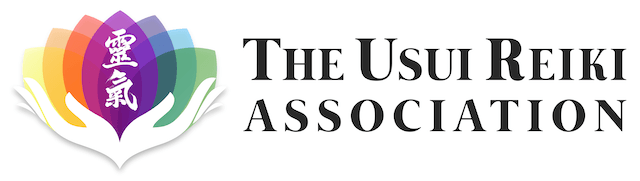
Old logo (above) and the new logo (below)
The exco wanted the logo to better reflect who we are and what we represent. We wanted the logo to also be aesthetically-pleasing that everyone would be proud to put in their marketing material.
Eugene thus took up the task of crafting a new logo that any reiki practitioner can instantly connect with.
We went through several potential logo designs before settling on one. Thereafter, we iterated upon the agreed design, which is the version you see today.
In the process of creating the logo, I pieced together several elements based on the following considerations:
Colours of the chakras
Healing hands
The Reiki word in traditional kanji
A pleasant font that exuded warmth and healing vibes
Square and landscape versions of the logo
Suitable for dark and light backgrounds
As you can see, it's not that trivial to design a logo that meets everyone's needs.
Affinity Photo was used to create the logo in vector format. This is particularly important because we want our members to have high-resolution copies for their physical printouts. It might sound over-the-top but the new logos are good enough for 5-metre signboard so go ahead and make a big banner!

The bulk of the effort was channelled to 2 parts of the logo. The first part was getting the colours right and blending well with each other. In the early iterations, the colours were either too dull or too light or too fuzzy.

The second part was for the arrangement of the words "The Usui Reiki Association", its size and spacing. The exco was torn between versions 2 and 3, and version 2 emerged winner at the end of the day. The idea was to have ASSOCIATION support the other words to create an aesthetically pleasing outcome. It took a great deal of tiny little tweaks with the spacing and font size to get it right. Not trivial at all!
After all the work, it passed the sniff test of Singapore's Registry of Societies and voilà! it's ready for prime time.
The meaning behind the logo is rather intuitive but here it goes anyway. The petals represent the 7 colours of the chakras and also the energy that emanate from your healing hands. The Reiki word is in Japanese Kaisho Old Standard style — used during the pre-war period when Usui Sensei was still in body. We all know that the traditional kanji word carries a great deal of meaning.
The new logo is easy to read and understand. We're certain you'll resonate with it.
TURA members can use the new logo in your marketing. Visit our brand guide for the full set of logos!


